‘Accidental Renaissance: the photos that look like Italian paintings’.
Here we’re going to explore some of the principles of design that are useful for you in the design of academic posters. These same principles are useful for the design of infographics. If an academic poster is the distillation of the same ideas that might turn up in an academic poster, then an infographic is a distillation of an academic poster.
-
Start by reading this short excerpt from the original draft of ‘The Historian’s Macroscope’ on kinds of visualizations.
-
Read the information below
-
Then try your hand at designing in Inkscape (nb that Powerpoint or Keynote can be used successfully instead, but I do not provide any guidance in that case.)
Vector versus Raster Graphics
‘Vector’ graphics are mathematical descriptions of points, lines, arcs, ellipses, squares and so on. If you’ve ever encountered an SVG file (‘scalable vector graphic’) then you’ve encountered a vector graphic. You can open an SVG file in your text editor and see this for yourself - line after line describing the points and coordinates. Vectors always look sharp, at whatever magnification you encounter them. They print out sharp too.
‘Raster’ graphics on the other hand are actual splodges of colour in a grid. With a small enough grid, viewed from the right distance, the colours seem to merge into each other. But if you zoom in, you’ll see the individual blocks of colour - the pixels. Hence the term, pixellated. If you grab a a screenshot of something on your computer, you’ve got a raster graphic. Typical formats are .png or .jpg. Both of these formats describe different ways of compressing the colour information row by row so that the file doesn’t occupy as much space on your machine. RAW formatted files are raster files where there is no compression (such as might be created by high-end digital cameras).
GIF files are rather like png files, except a gif can contain multiple images in it - which is how we end up with animated memes.
Colour Theory
There’s a lot of bumpf out there on the ‘pyschology of colour’. Google it to see what I mean (Youth Designer has a good example). A lot of what you see here isn’t so much psychology as it is associations (and indeed, western associations, at that). Associations are important of course; you don’t want to undermine your message by making some unfortunate connections.

Full disclosure: I’m not very good with colours. At Color Brewer you can use it’s interface to design a palette for your data that will be appropriate for the nature of your data - select the ‘colorblind safe’ at the very least to obtain a color scheme that will be intelligible as possible to as many people as possible. The ‘export’ tab will give you the official names or values for the colors, which you can then use in whatever program you’re designing in.
Typography
Typography plays an important role in visual communication (there’s a good short introductory video here). It can do everything from reduce eyestrain (do a search for ‘easiest fonts to read on screen’) to communicate power and authority. Is it any wonder that strong bold capitals come to be known as ‘Roman’? But first: are you a comic sans criminal?
NB Serif fonts are sometimes not as accessible as sans-serif fonts. Older screens and monitors can have a difficult time rendering serif fonts. Sans-serif fonts can be more readable across different screens. However, this does not mean you should throw away serif fonts — many serif fonts can be quite accessible and add to your design goals if used properly. For more information on accessible fonts, check out WebAIM’s article on the topic.
Play some rounds of Typeconnection. Pay attention to why — or why not — various pairings work.
Sprucing up a PDF in Inkscape
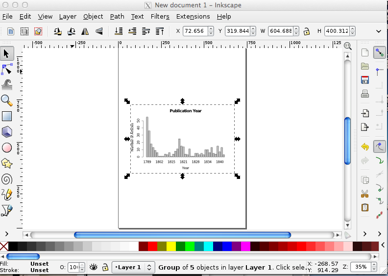
In this first exercise, we will take a plot we generated R where we made a bar chart showing the number of articles by year. In R I exported that plot as a PDF; it is a vector graphic. In Inkscape, we can import that PDF and ‘explode’ it so that we can manipulate its parts individually. We are going to take the simple bar chart and make it more legible, more visually appealing, for incorporation on a webpage.
- Download and install Inkscape .
NB Mac the installation instructions are a bit more complicated for Mac. Pay attention and follow closely!
-
Here is the pdf I generated that you can use; right-click and save as: publication-year.pdf
-
Take a quick look at that file by double-clicking on it (not in Inkscape, not yet). It’s a pretty plain graphic. Right away there are at least two things we could do to make it more visually appealing. We could change the orientation of the characters in the y-axis to make them more legible. We can highlight bars of interest. And we could apply a colour scheme more generally that would make our graphic legible to folks with colour-blindness.
-
Start Inkscape.
Click File » Import » and then navigate to where you saved publication-year.pdf.
-
Click Ok when you’ve got it selected.
-
In the next pop-up, just accept the default settings and click ‘ok’. Your Inkscape window should now resemble the following:
-
The PDF is now a layer in the new image you are creating in Inkscape. You can save this drawing, with its information about the layers and what is in each one by clicking File » Save As. Choose SVG. (My version is here).
-
Do you see the bounding box around the plot? If you grab any of those handles (the double-arrow things), you can make it bigger or smaller on your sheet. To retain the image proportions, hold ctrl + shift as you drag.
-
We can’t edit any of the other elements yet — we can’t change the colour of the bars, or the fonts of the text. We have to tell Inkscape to ‘explode’ these elements into their own ‘objects’. In the menu bar at top, got to Object » Ungroup. There are now a series of overlapping bounding boxes around each object.
-
Zoom in (by pressing the
+plus sign on your keyboard) so that you’re looking at the numbers of the y-axis. We’re going to rotate these by 90 degrees to make them more legible. Select the arrow icon from the toolbar on the left side of the screen. -
Click on the ‘50’. You’ll get a bounding box around it.
-
Click Object » Rotate 90 CW. The 50 is now rotated! Do the same for the other numbers.
-
Save. (If you double-click on the number, you might trigger the ‘text edit’ function. If you do that, no problem — you can change the font, change the number… although if you did that, it’d be a bit dishonest, right? Click on the arrow pointer icon in the toolbar again to get out of the text-editing function).
-
Let’s imagine, for whatever reason, that you wanted to change one of the bars to a different colour, to highlight its importance to your argument. With the arrow icon, click on one of the bars so that you get the bounding box around it. Then, click on one of the colours from the palette at the bottom. Boom! You’ve got a newly colourized bar.
-
Save.
-
Add a legend. Write it so that the important message you want your viewer to get is immediately clear. Choose a font from Inkscape’s included fonts that supports your message.
-
To export your image so that you can use it in a website or paper, click Edit » Select All in All Layers. Every element of your image will now have a bounding box around it.
-
Go to File » Export Bitmap. Never mind the options in the popup; just hit ‘Export’. Inkscape will automatically assign your drawing a name with
.png.
Remember if you want to edit this image again later, hit the ‘Save’ button to save it as an SVG. The SVG will preserve all your layer information, while the PNG file is the visual representation (the PNG is in fact a raster graphic). Most browsers can handle SVG files, so you could use that in your website; programs like Word seem to be able to handle raster graphics better than they do SVG. You might want to experiment. In any event, every journal has different requirements for image formats. You would export your image to whatever those specifications are.
Custom Colour Palettes
In infoheap’s tutorial on Inkscape, you will learn how to load a custom colour palette. Why might you want to do that? You should be designing your work so that it is as universally accessible as possible. Many folks are colour-blind.
- Use Color Brewer to generate a colour-blind safe palette.
- Then look for the ‘GIMP and Inkscape — GIMP color palette for this scheme.’
- Click on that link, and you’ll get a text file with the scheme you generated.
- Use that scheme to alter the colours on your plot.
Make an Academic Poster
A good poster tells a story in 2 to 5 minutes of study. It is not a wall of text, nor is it an exercise in minimalism. It is, rather, a distillation of essence. At least, that’s my opinion. You can google ‘good academic poster design’ and you’ll be swamped with results. Ultimately, it comes down to good design, full stop, and a clear powerful message you want to convey: not I hasten to add, one full of detail and nuance, but one that makes the viewer stop and take down the URLs to your ‘more details|full paper|project website’ pages! (Which incidentally should be shortlinks; you can use something like bit.ly or you can keep things under your own control with something like yourls.)
Become aware of the []‘Rule of Thirds’](https://designwebkit.com/web-design/rule-of-thirds-web-design/).
Heed some of the basic advice on good academic poster design. There is also some useful info here on parts of a poster, layout and design, and images.
Check out some templates for effective academic posters https://colinpurrington.com/tips/poster-design/#templates
Inkscape
- Download one of the scientific poster templates from Ugo Sangiorgi (These are developed from a blog post by Felix Breuer; note Breuer’s discussion on design).
- Open it in Inkscape.
- Adapt your favorite academic essay you’ve written at Carleton to be the content for your poster. (And don’t tell me that you haven’t got one!)
- Make notes in your representation from the point of view of layout: what elements of the design work? What aren’t working? How would you repurpose this poster to fit the requirements of the assessment exercise
- Upload the SVG, PDF, or PNG version to your repository.