Image Analysis
In recent years, historians have started to deal with photographs or videos / video stills as historical documents. Arnold and Tilton call this ‘distant viewing’. There are a variety of ways this might pan out; one might identify and analyze colour and composition of key frames in a recording of a historical event. One might track objects or people. In a recent piece of my own, we asked the computer to identify objects and contexts to describe ‘scenes’ in images pulled from Instagram, in order to explore how people constructed their own ‘cabinets of curiosities’ (which you can read here, connected to the trade in human remains.) Lev Manovich has done a number of pieces looking at amongst other things, selfies by city, or 4535 covers of Time magazine (more on his work here). Ian Milligan extracted art work from the first era of the web, the 1990s, and used ImageJ to study patterns in how people presented them on Geocities.
There’s a lot you can do, and there are many different approaches. Here, we’ll use a web toy by Zach Whalen called ‘Imj’. Whalen writes,
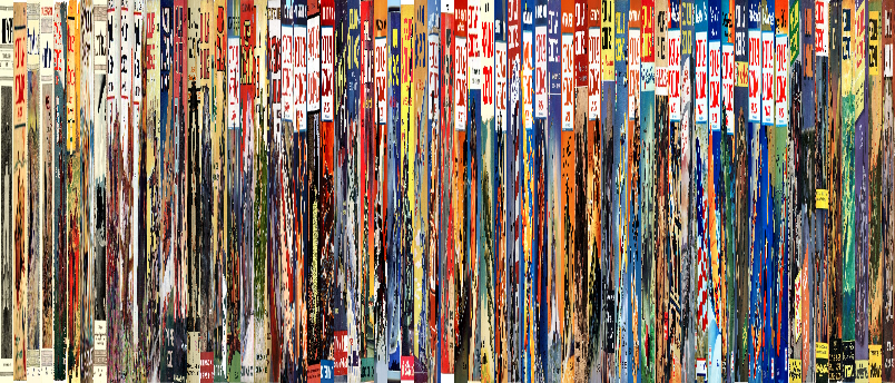
So-called “movie barcodes” are both elegant to look at and useful ways to explore how color schemes and designs shift throughout a film. Image montages can also demonstrate how a visual corpus changes over time, and plotting an image set into a graph based on values like hue and saturation could provide a stylistic fingerprint for particular set.
Visual culture analytics or macroanalytics is a methodology for drawing interpretations of large sets of data with the aid of computers. Just like scholars may use computational tools to analyze n-gram frequencies in literary corpora, for example, others also like Lev Manovich use software to create similarly condensed or arrayed views that reveal patterns and trends within visual corpora.
Imj is a tool for creating a rapid visualization of a corpus of images, so that you can determine whether or not you might like to look into more complex tools for deeper analysis. You can read Whalen’s description of what the tool does here.
- Download this corpus of materials: https://archive.org/details/0011919FebruaryPopularScience. These are covers from ‘Popular Science Monthly’ held at the Internet Archive. Hit the down button beside where it says ‘72 original’ to download it all as a zip file.
- Unzip it, have a look around inside; finder and explorer can show you thumbnails as you browse. Do you spot anything interesting?
- Look at the metadata. The metadata is actually there in the file name. If you sort the files alphabetically in your file explorer or finder you’ll see that you have covers from 1912 to 1946, and thus perhaps some insight into the popular consumption of science over thirty years. There are some files with
.torrentor.xmlor.sqlite; you can delete these. Then there are two files with typos in the years which you can rename easily. Delete the file for the thumbnail image too (which has ‘thumb’ in its filename.) - Upload to Imj here: http://www.zachwhalen.net/pg/imj/
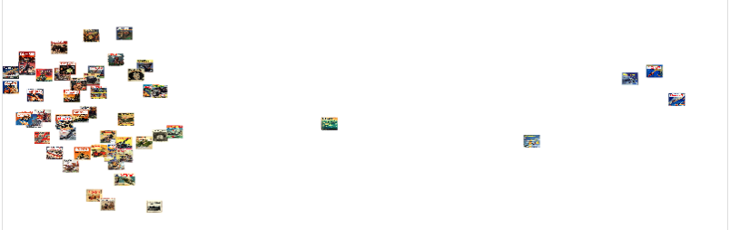
- Try the different visualization tools. There is no ‘right’ answer to the question of visualization here. Instead, you are trying to ‘deform’ your perspective, you’re trying to get a large-scale overview, of interesting patterns that might be present. Some tools might give you more intuitively sensical results; but remember Matthew Lincoln’s warnings against ‘confabulation’… You might find, when you plot hue against brightness, that some interesting clustering seems to happen. Having spotted a pattern, jump back into the corpus to see why that might be the case…
- Go back to the Internet Archive, see if you can find other interesting image corpora to explore. How ambitious are you? Here are one million album covers!. Here are more magazines!. With a bit of creativity, you could also grab all of Maclean’s Magazine for some CanCon.
- Download your results, add them to your notes and your current repo.